
Indigo Illusions

"The Alt Co. really captured our vision and essence for the studio and was able to turn this into a fantastic new visual identity for us."

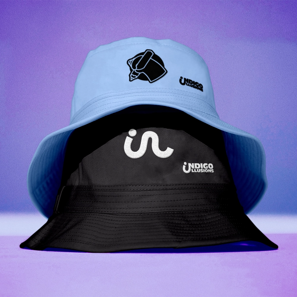
Lucy & Jake from Indigo Illusions animation studio, approached us to create a new brand identity to match the bold and beautiful work they create for their clients, & their fast growing reputation since launching back in 2018.


Indigo Illusions
Design & Production
Identity & Web Rebrand
Lisa Love

Indigo Illusions
Design & Production
Identity & Web Rebrand
Lisa Love


We began the Indigo wordmark development with a hand-drawn type design, inspired by expressive graffiti styles and pop culture influences. In Round 1, we explored stylescapes that merged bold, vibrant colors with dynamic artistic references, creating a visually striking yet authentic brand presence. Moving into Round 2, we refined our approach by experimenting with playful elements and illustration. This phase led to the development of the hand logo, which introduced a more animated and engaging aesthetic. By balancing artistic freedom with a structured identity, we arrived at a design that captures both the bold energy of graffiti and the polished adaptability needed for branding.


"The Alt Co. really captured our vision and essence for the studio and was able to turn this into a fantastic new visual identity for us."
